


# ServerFormDemo详解
# 概要
Geyser的服务端FormUI基于Cumulus,允许开发者直接通过服务端接口生成客户端UI,不需要编写客户端Mod。
基础的用法和 Geyser官方文档 (opens new window) 中演示的相差不大,只是发送逻辑需要通过SpigotMaster调用,而不是Floodgate插件
# 准备工作
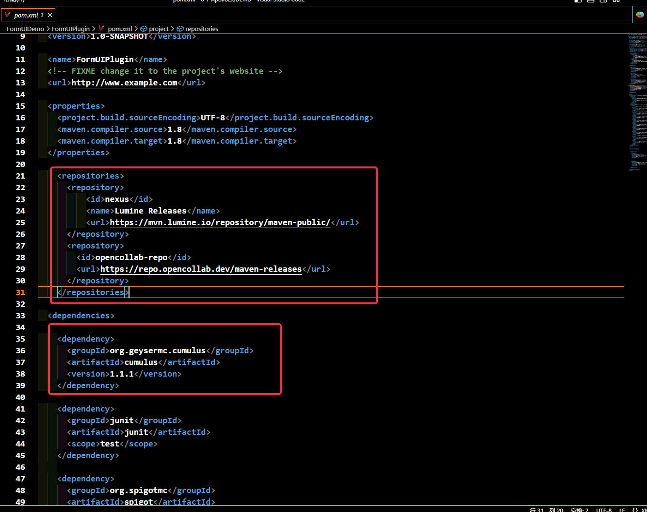
在编写FormUI逻辑前,需要先添加依赖,具体如下图所示:
  <repositories>
    <repository>
        <id>nexus</id>
        <name>Lumine Releases</name>
        <url>https://mvn.lumine.io/repository/maven-public/</url>
    </repository>
    <repository>
      <id>opencollab-repo</id>
      <url>https://repo.opencollab.dev/maven-releases</url>
    </repository>
  </repositories>

  <dependency>
    <groupId>org.geysermc.cumulus</groupId>
    <artifactId>cumulus</artifactId>
    <version>1.1.1</version>
  </dependency>
# Java插件开发流程
Demo中的Java插件演示了三种FormUI及FormUI响应处理逻辑,其具体的适用范围、实际效果我们一一讲述。
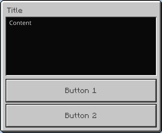
# ModalForm
应用场景:
ModalForm是最简单的表单形式,但可定制程度较低
仅支持标题、内容和两个按钮
命令格式为:
复制/showForm 1具体代码示例如下:
复制ModalForm.Builder builder = ModalForm.builder() .title("Title") .content("Content") .button1("Button 1") .button2("Button 2") .validResultHandler((response) -> { if (response.clickedButtonId() == 0){ System.out.println("点击了Button 1"); } else{ System.out.println("点击了Button 2"); } }); spigotMaster.sendForm(player, builder);最终效果如下:
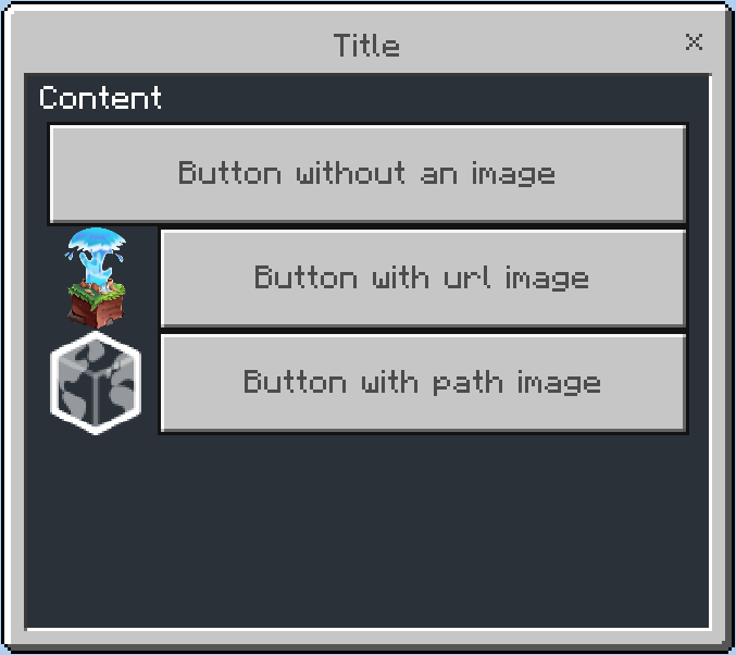
# SimpleForm
应用场景:
SimpleForm比ModalForm稍显复杂,但是可定制程度也更高,支持带图片按钮
仅支持标题、内容和不限数量的按钮
命令格式为:
复制/showForm 2具体代码示例如下:
复制SimpleForm simpleForm = SimpleForm.builder() .title("Title") .content("Content") .button("Button without an image", FormImage.Type.PATH, "") .button("Button with URL image", FormImage.Type.URL, "https://github.com/GeyserMC.png?size=200") .button("Button with path image", FormImage.Type.PATH, "textures/map/map_background.png") .build(); spigotMaster.sendForm(player, simpleForm);最终效果如下:
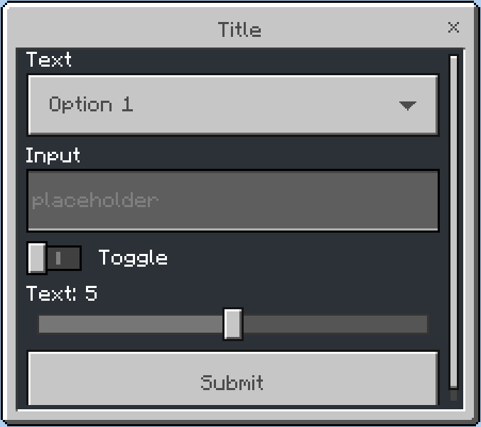
# CustomForm
应用场景:
最为复杂,但是可定制程度最高
支持标题、内容、标签列表、滑块、输入等等
命令格式为:
复制/showForm 3具体代码示例如下:
复制CustomForm customForm = CustomForm.builder() .title("Title") .dropdown("Text", "Option 1", "Option 2") .input("Input", "placeholder") .toggle("Toggle") .slider("Text", 0, 10, 1, 5) .validResultHandler( (response) -> { System.out.println("option:" + response.asDropdown(0)); System.out.println("input:" + response.asInput(1)); System.out.println("toggle:" + response.asToggle(2)); System.out.println("input1:" + response.asInput(3)); System.out.println("slider:" + response.asSlider(4)); } ) .build(); spigotMaster.sendForm(player, customForm);最终效果如下:
# Form表单响应处理函数
命令格式为:
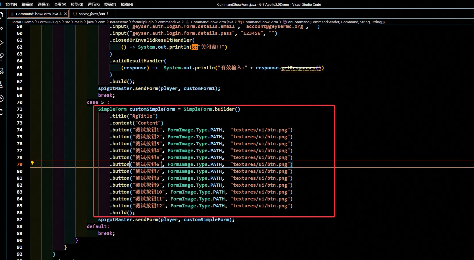
复制/showForm 4具体代码示例如下:
复制CustomForm customForm1 = CustomForm.builder() .title("geyser.auth.login.form.details.title") .label("geyser.auth.login.form.details.desc") .input("geyser.auth.login.form.details.email", "account@geysermc.org", "") .input("geyser.auth.login.form.details.pass", "123456", "") .closedOrInvalidResultHandler( () -> System.out.println("关闭窗口") ) .validResultHandler( (response) -> System.out.println("有效输入:" + response.getResponses()) ) .build();
# 进一步扩展
# 上述方案的局限性
从上面几种form的效果我们可以看到,在不修改客户端Json配置的情况下,FormUI的布局、贴图等表现效果十分受限,排序只能从头列到尾,控件效果也只有单调的一种
# 扩展方案
我们可以通过修改客户端JSON配置文件,来让FormUI的样式更丰富,同时不需要编写额外的客户端Python代码。
在阅读下述内容前,默认开发者已阅读过 客户端ui开发相关知识
同时默认开发者已阅读过 客户端基础ui知识 (opens new window)
# 样例效果
命令格式为:
复制/showForm 5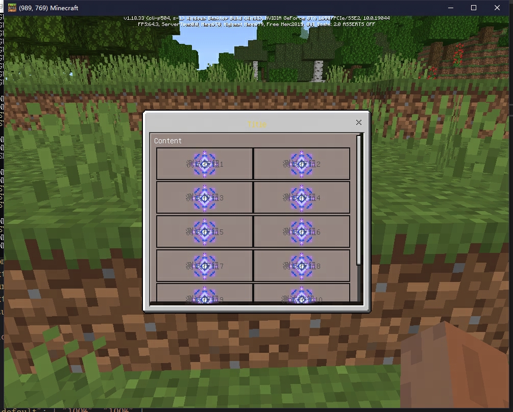
# 修改流程
复制一份引擎中的server_form.json(具体位于开发包/data/resource_packs/vanilla/ui/下),到自定义mod中
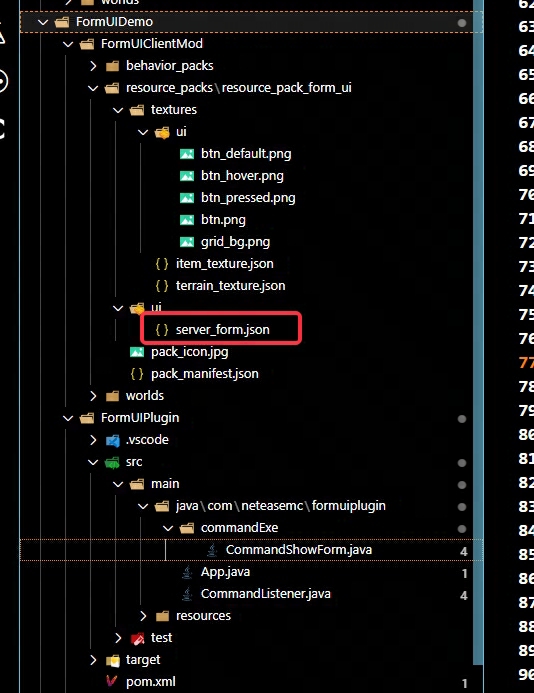
首先我们在中间插入一份自定义控件apollo_demo_switch_long_form,注意代码中注释
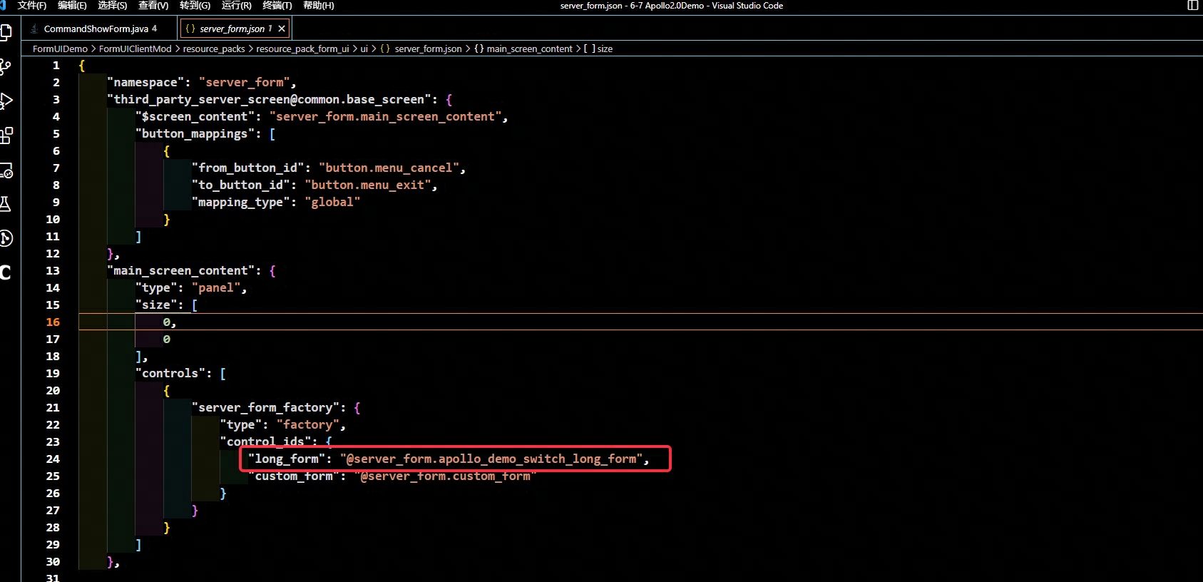
复制"apollo_demo_switch_long_form" : { "type" : "panel", "size" : [ "100%", "100%" ], "layer": 1, "anchor_from": "top_left", "anchor_to": "top_left", // 首先定义标志位变量,用于标题的判断 "$flag_grid" : "§g", "controls": [ { "long_form@long_form" : { "enabled" : false, "visible" : false, // 通过绑定,我们可以判断标题,当标题不以**§g**开头时,显示原生long_form "bindings" : [ { "binding_type" : "global", "binding_condition" : "none", "binding_name" : "#title_text", "binding_name_override" : "#title_text" }, { "source_property_name" : "(((#title_text - $flag_grid) = #title_text))", "binding_type" : "view", "target_property_name" : "#visible" }, { "source_property_name" : "(((#title_text - $flag_grid) = #title_text))", "binding_type" : "view", "target_property_name" : "#enabled" } ] } }, { "grid_long_form@grid_long_form" : { "enabled" : false, "visible" : false, // 通过绑定,我们可以判断标题,当标题以**§g**开头时,显示我们自定义的grid_long_form "bindings" : [ { "binding_type" : "global", "binding_condition" : "none", "binding_name" : "#title_text", "binding_name_override" : "#title_text" }, { "source_property_name" : "(not ((#title_text - $flag_grid) = #title_text))", "binding_type" : "view", "target_property_name" : "#visible" }, { "source_property_name" : "(not ((#title_text - $flag_grid) = #title_text))", "binding_type" : "view", "target_property_name" : "#enabled" } ] } } ] },定义五个自定义控件
grid_long_form@server_form.long_form
继承自原生server_form.long_form
grid_long_form_panel
为内容面板增加了背景贴图
复制{ "bg" : { "type" : "image", "size": [ "100%", "100%" ], "layer" : 1, "fill" : true, "nine_slice_buttom" : 4, "nine_slice_left" : 3, "nine_slice_right" : 4, "nine_slice_top" : 4, "nineslice_size" : [ 3,3,4,4 ], "is_new_nine_slice" : false, "texture" : "textures/ui/grid_bg" } },grid_long_form_scrolling_content@server_form.long_form_scrolling_content
继承自原生server_form.long_form_scrolling_content的滚动面板,内容填充为grid_long_form_dynamic_buttons_panel@server_form.grid_long_form_dynamic_buttons_panel
grid_long_form_dynamic_buttons_panel
自定义的grid面板,用于生成动态按钮,从配置中可以见到,我们定义该面板由6行2列组成,每项控件模板为server_form.grid_dynamic_button
复制"grid_dimensions" : [2, 6], "grid_item_template": "server_form.grid_dynamic_button"- grid_dynamic_button 自定义的按钮面板,除了原生按钮外,还增加了按钮的背景贴图
复制{ "bg" : { "type" : "image", "size": [ 32,32 ], "layer" : 4, "texture" : "#form_button_texture", // 通过绑定,我们把Form中的icon参数传给image的texture // 详细到代码即为:.button("测试按钮7", FormImage.Type.PATH, "textures/ui/btn.png")中的第三个参数 "bindings": [ { "binding_name": "#form_button_texture", "binding_name_override": "#texture", "binding_type": "collection", "binding_collection_name": "form_buttons" } ] } }, { "form_button@common_buttons.light_text_button": { "$pressed_button_name": "button.form_button_click", "anchor_from": "top_left", "anchor_to": "top_left", "size": [ "100%", 32 ], // 此处把按钮的三种贴图都设为空,因为我们不希望原生按钮的贴图显示出来 "$default_button_texture" : "", "$hover_button_texture" : "", "$$pressed_button_texture" : "", "$button_text": "#form_button_text", "$button_text_binding_type": "collection", "$button_text_grid_collection_name": "form_buttons", "$button_text_max_size": [ "100%", 20 ] } }最后,我们把原生的long_form的定义改为我们自定义的控件**@server_form.apollo_demo_switch_long_form**
long_form对应的是SimpleForm,custom_form对应的是CustomForm
Spigot中我们构造如下的Form,把Title设置为**§g**开头
至此,扩展FormUI结束,不同样式的FormUI我们增加不同的标题前缀
# 鸣谢
感谢 布吉岛(妖猫) 团队对扩展FormUI功能的支持
入门
40分钟